What happened in Spain?
I’m a bit wary of becoming one of those armchair epidemiologists who’s wise after the fact and pontificates on what people under far more pressure decided when they didn’t have the benefit of hindsight. So I won’t. Pontificate, that is.
This post is a response to a request. My brother spends a lot of time working with the Swedish and UK health systems, but actually focuses on the Spanish health system at the moment. He wanted to know about Spain’s experience (so far) of the coronavirus pandemic and whether there was anything we might learn from it.
As in the previous posts, I’m going to concentrate on mortality statistics. If you’re too busy to read it all, here are the headlines:
- Spain overall had a hard time of it, and is likely to have problems for a long time to come
- That hard time was not evenly distributed in the population. Some areas were very severely affected, with others showing very little raised mortality
- Spain has a good data foundation to develop resilience to epidemics, but that will depend on being able to act rapidly to signals seen in the data
- Even in the worst affected areas, many people will not have been directly impacted by death, but most people will be aware of people who died
- Spain, England and Wales, Sweden, and Germany are very different countries in rather surprising ways
Getting the data
One of the most interesting things about this whole process has been the experience of getting data. Getting data for England and Wales was easy, and it only took a few minutes to find the Swedish data despite my Swedish language skills extending only so far as asking for, offering, and receiving coffee (all this can be achieved using the single word ‘kaffe’ – the Swedes are a pleasantly direct nation). In contrast, the German data were not routinely available at all and apparently none of the thousands of people commenting on the outbreak in Germany actually asked for them until May.
Spain was a revelation.
Spain has multiple bodies devoted to collecting statistics and tracking disease, including the Instituto de Salud Carlos III (ISCIII). I knew this had the information I needed from the content of the website, but I couldn’t find it initially. What I did find was an actual journalistic article using raw data. Seeing actual data was brilliant and a real breath of fresh air, but what was even better was that the journalists, from El Pais, shared the sourcing of their data. This showed that the ISCIII had a Mortality Monitoring system (MoMo), which ties in to a larger European system supported by transnational bodies like the European Centre for Disease Prevention and Control (ECDC). It gets better though. MoMo actually provide their raw data through a dashboard. More on this later…
What do the data show?
The Spanish data are somewhat different to the other countries in that they come with reference values pre-calculated. Deaths are reported daily and they come with an expected value and upper and lower percentiles. I’ve included these in the plot below.
As before, I’ll start by showing the raw data, in this case daily deaths:
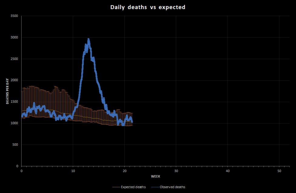
You don’t need me to tell you that the peak is pretty dramatic/horrific. At its worst, on 31st March, Spain saw 2,963 deaths recorded in a single day against an expected number of 1,140. That’s over 2.5 times the deaths expected.
That’s obviously a lot worse than Germany and Sweden. Is it worse than England and Wales?
I don’t have daily values for England and Wales, but I do have weekly values. On week 16 (week ended 17th April), England and Wales had 22,351 deaths against an average 10,198 in 2010-2018. That’s about 2.2 times what we would expect, but it’s over a week so the daily peak was probably a bit larger. Crudely then, the outbreaks in Spain and England and Wales were of the same magnitude.
That’s a bit of a crude comparison, so let’s do what we did before. Let’s scale the values to get a rolling weekly value for deaths per 100,000 population. To do this I’m estimating the Spanish population at 47,100,396, which is what Spain’s National Statistical Institution (the INE) estimates.
Here’s what that looks like:
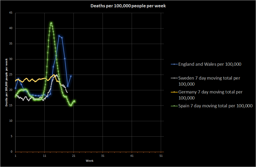
This shows that Spain overall did have a bigger peak than England and Wales. It also shows that Spain had a flu season in 2020, just like England and Wales, and that the reduction in deaths following the peak was as rapid as in England and Wales and arguably more rapid than Sweden.
Look at where the peak is, though. I mentioned before that the discussion of various parts of England and Wales being before or behind other areas was not really credible (based on death data anyway). Spain clearly was a couple of weeks ahead of England and Wales.
Incidentally, I’m still puzzled by the German death data. I don’t know what’s going on there. If I didn’t have previous data for Germany, I would assume that it had an ongoing, fairly serious, controlled epidemic, but the data suggest that these numbers of deaths are normal for Germany. I don’t know if there is something very odd about Germany or if I’ve made some fundamental mistake in my analysis. Either way, let me know if you have any ideas!
Sticking with Spain, the next most obvious question is whether different regions experienced different epidemics. Spain has a comparatively low population and is quite big, giving it an approximate population density of 93 people per km2 compared to 393 in England and Wales and 232 in Germany. It is more than Sweden at 23 people per km2, but it is low enough that a phased outbreak or even focused outbreak is possible.
Did Spain get sick all at once?
Spain is not federal in the way that Germany is, but it does have a number of autonomous communities. If I plot the raw death data for each of these, I get the following. Do note that these areas vary quite a bit in terms of population:
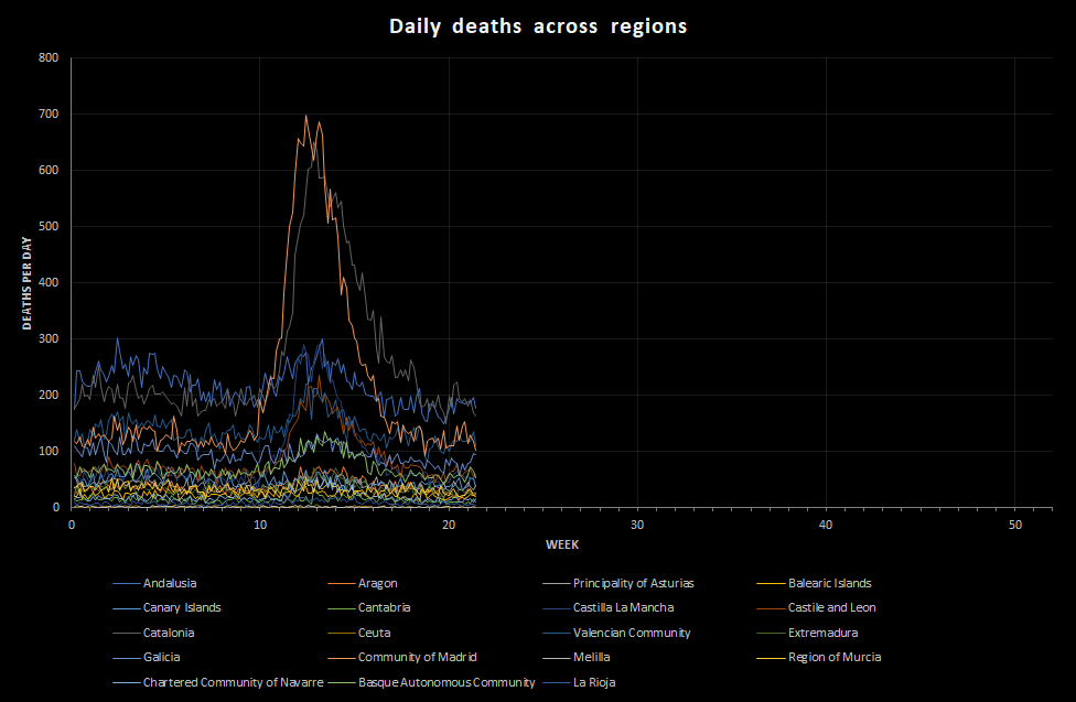
When I plotted this, I felt moved. These regions vary dramatically from one another. That means that the toll felt by Spain as a nation was not largely distributed across the country, as it was in England and Wales, but bit deeply in certain key regions. Madrid and Catalonia are the most obvious, but also areas like Castilla la Mancha.
Comparing these regions is difficult because of the marked difference in population, so I’m going to scale the results to deaths per 100,000 population per week as before to allow comparisons between regions, but also between these regions and other countries.
I’m going to shamelessly use the Wikipedia population estimates for these autonomous communities in my calculations at this point so that I can get all the results on the same scale. Again, some of these areas have very low populations, and that makes the number per 100,000 a bit difficult to use for areas like Mellila, but I think it helps a bit:
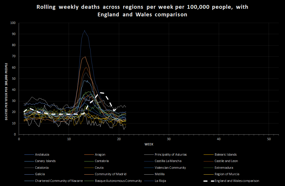
This shows just how misleading the national data can be. Yes, Spain overall had a peak that was somewhat more severe than England and Wales, but individual regions in Spain experienced levels of death that vastly exceed England and Wales. The biggest peak is Castilla la Mancha, which experienced a peak of over 90 deaths per 100,000 people per week.
What does it mean?
I’ll start with the human effect, because I think that matters a lot in understanding how to balance risks in an outbreak.
In an earlier post, I mentioned that the level of death in England and Wales was such that many people would be aware of someone who had died, be most people would not be in direct regular contact with someone who had died. The picture would be variable, and people working as carers or in intensive care or in the care of the dead and their relatives would see a lot more. At 90 deaths per 100,000 people per week, that has changed.
In the UK our family physicians are called General Practitioners (GPs) and they work together in practices serving a local area. An average GP practice in England and Wales serves about 9,000 patients, which is the population of a small town. It’s a reasonable measure of community size.
The normal death rate at this time of year is about 17 people per 100,000 per week, which means that an average GP practice sees around 3 patient deaths every 2 weeks. That’s very approximate. During the England and Wales peak, that would have risen to a little over 3 per week. That’s a doubling of the death rate.
If England and Wales had experienced the same rate of death of Castilla la Mancha, a typical GP practice would have seen 8 deaths per week. That is enough for the processing of deaths to become a real challenge. The paperwork will be difficult for family physicians and, due to death clustering, occasionally overwhelming, but generally just about manageable. The care of families affected by grief will not be manageable, certainly not while maintaining adequate care of a normal caseload.
If you’re working in an intensive care unit or a mortuary, it is enough for the system to break down. It is enough that, as a normal person, you know of people dying locally every week.
That is enough death to make you directly concerned for the wellbeing of your family every single day. In the UK, we had a level of death that allowed us (so far) to worry about vulnerable people while feeling reasonably safe ourselves (unless we were vulnerable). In the worst affected parts of Spain, everyone would have felt that fear.
At that level, I would expect measurable psychological effects, particularly among health and care staff and those with conditions that make them vulnerable. That’s not to mention the long-term health effects on those who have got ill but not died.
Large areas of Spain, though, experienced (again, so far) relatively low levels of death, consistent with what Sweden or even Germany experienced. They still experienced lockdown, and many people in these areas will have had family in the badly affected areas. These areas are now coming out of lockdown and possibly seeing visitors from other areas coming in, desperate to see family. This raises the risk of disease transmission, but also of the divisive effects of worry on social cohesion. Managing coming out of lockdown in Spain means balancing the real risks and the perceived risks across a very diverse country.
Why would it vary so much between areas?
I don’t know. I initially assumed that transport between regions must have stopped or reduced early, but I can’t see evidence for this. Maybe Spain really is just much more regional than England and Wales and even Germany. If so, the pattern suggests (very tentatively) a number of local outbreaks, presumably from external travel, with some being successfully contained and others becoming unmanageable. I may, of course, be wrong.
One thing I would like to be able to do is to look at case mortality across different areas. Remember, the data here are just deaths. What I haven’t yet been able to look at is whether the number of cases drove the number of deaths in each region or whether some areas experienced a higher mortality rate. This is important across countries because it allows us to look at whether different viral strains are emerging and whether some strains are more lethal than others.
My understanding is that there is not currently strong evidence for differences in the lethality of different strains seen in the current outbreak, although there is a lot of academic discussion about different strains. However, looking at specific strains in different regions of Spain could help us understand future viral spread in the country. This is important because, if spread is primarily within the country, effective lockdown might concentrate on restricting internal movement. If spread is caused by lots of focal transmission events from elsewhere, restrictions on international travel and rigorous containment of local outbreaks might become more important.
What can we learn from Spain?
It is tempting to act like we can’t learn anything from places where things went wrong in some way, but that would be a mistake. Spain achieved remarkably rapid control of a runaway epidemic that was killing people at an astonishing rate. It contained a number of regional outbreaks. It also, because its peak was early by European standards, started moves to reduce lockdown before many other European countries. That difficult decision was only possible because of good quality disease surveillance from the individual clinician and coroner up to the national level.
I got excited by the data available from Spain because most statistics agencies provide data in fairly horrible spreadsheets. If we can get to the stage of having data flowing into publicly available repositories that are accessible using an API we will rapidly find that tracking emerging health threats becomes easier. Why? Well, it means people can concentrate separately on collecting data or analysing it without having to set up formal relationships. When major health crises occur, public health bodies can then get assistance from other people and can share data with each other rapidly. Imagine that.
The biggest problem with everything I’ve said in all these posts is that they depend on hindsight. Deaths take time to occur and then time to report and collate. That is time during which public health teams are blind to the emerging situation. What can we learn from Spain, perhaps from the differences between regions, about how we all could handle these outbreaks?
I don’t want to be an armchair expert, particularly when the cost paid by these regions is so large. I think, though, we need to understand to help us all. All four of the countries I’ve now looked at differ a great deal. England and Wales experienced a relatively coordinated outbreak across the country (although, that may vary if we looked at cities only). Spain experienced profound regional differences. Germany saw very few deaths, and Sweden appears to have managed to limit spread through social obedience and individual judgement. Given all that variety, are there any messages at all?
Yes, of course there are:
- Covid-19 is serious – It has the capacity to overwhelm health systems. Once established, the measures to prevent its spread can overwhelm economies
- Not everyone is affected equally – The burden of illness very much depends on where outbreaks are. This means that lockdown measures depend on the credibility of public health teams. It also means that you may have to ask people to make sacrifices when they are not seeing any real evidence of an outbreak.
- Normal public health approaches seem to work – Early management probably depends on identifying nodes of infection and avoiding transmission from them. This is likely to mean very tight restriction of a small number of people fairly regularly during an outbreak. More general restrictions are needed when local containment starts to fail
- Getting public health measures to work depends on the appropriate exercise of authority – If your country is almost entirely at income level 4, the chances are that people are not used to having their freedoms curtailed. Getting them to self-limit depends on credibility and consent. This is remarkably similar to the Peelian principles and policing by consent. At lower income levels, you will have similar problems, but accentuated by the real risk of hunger and the need to find measures that can work without causing serious second-order problems.
- Local resilience matters – Even in countries with very strong state control, like China, outbreaks will occur. The only way to control those is to limit their spread externally through restrictions on movement and have measures for handling outbreaks locally.
- National and international support matters – When countries are left to manage on their own, they worry less about external travel. More importantly, it is easier to manage an outbreak in a single city than a single country, or a single continent. National and international surveillance mechanisms are necessary, but action on their data is also required.
We clearly can’t veer between complete international lockdown and total freedom on a regular basis. That means we have to have a graduated approach to disease surveillance and control. That’s what organisations like the European Centre for Disease Control (ECDC) are all about. If we think of health protection as being layered, like onion skins, we may be able to get something positive out of all this.
Currently, my local shops have plastic screens up and hand sanitiser available. At some point, those barriers will start to come down. Now imagine if:
- All of us had information on which measures work to reduce disease transmission
- Those measures could be enacted voluntarily when the local public health monitoring system warned them of a heightened annual flu risk
The transmission of flu might slow, the number of hospitalised patients might go down, and there may be more money for things like social and mental health care.
Now, imagine if everyone did exercise each day.
The next impact on our lives may be very different to Covid-19, but resilience is something that can be built in to all our lives. Some people will need more help than others because of circumstance.
None of this is new, but future or remote risks, like ill health later in life or disease outbreaks, are difficult to factor into our decisions. Even now, many of us are not seeing the reality of the Covid-19 risk because it is being managed aggressively. I guess that’s the biggest message that the data has for us. Just because we aren’t currently in a horrible situation personally, it does not mean things are not serious. We do not need to panic, but we do need to act coherently, rationally, and with care for those around us.
Leave a Reply
You must be logged in to post a comment.