How science and statistics can keep us balanced
I have’t posted on Monkeyglandin for a long time, but I want to share a little bit on the off chance that it’s of some use.
A big part of good quality analysis is looking at the world objectively and I try to do that, in part, by taking numbers and looking at them in different ways to see if they hold patterns I can use to understand the world.
I was having a chat with my brother about how annoying it was to get force-fed death statistics for Covid-19 for different countries without any data about how big the populations of those countries were or what a normal year looked like. Frankly, I was finding it difficult to decide what I should worry about and what was just politics and news creation. I thought I’d look at some UK statistics to see if they could help and check if it’s possible to get your own data to understand things better.
The headlines are:
- Covid-19 is definitely more serious than a normal flu season
- Without intervention it would definitely overwhelm UK public services
- However, most of us will not be directly affected by deaths at the moment
- Those in health and social care and those handling the logistics around those are already severely affected
- It is rational that different countries take different approaches to managing an outbreak
This post is not about what any particular country should, or should not, have done when faced with this disease. It is to help you understand some of the more confusing stuff like, “Why is it that the health system’s struggling, but I don’t know anyone who’s been seriously ill?” More importantly, it’s to show you that anyone can start to investigate the data themselves.
What do the data say?
The UK is pretty good when it comes to open data. In particular, we have the rather awesome Office for National Statistics (ONS) which publishes all sorts of data that you can use as a member of the public to keep yourself informed. One of the datasets is a weekly summary of death statistics for England and Wales. Now, this dataset does include a Covid-19 section now, but I chose to ignore that to begin with because death certification is not perfect and recording of Covid-19 is likely to increase as awareness increases. Instead, I looked at all-cause death.
These data are rather interesting and I think they provide an important reference source because currently media sources are fixated with absolute death rates, which fail to account for base rates. Here are weekly death rates going back to 2010, with 2019 and 2020 highlighted. Note that the weeks are numbered 1-52 and the data for 2020 only go up to 10th April (week 15). The UK lockdown started in week 13.
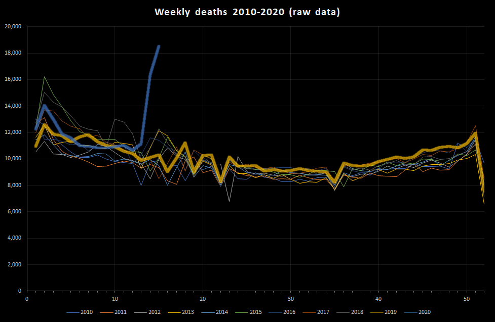
As you can see, there is a clear excess of deaths this year but it is only apparent from approximately week 13-14 (the data only go as far as week 15 – the week ended 10th April). Indeed, it is only around 3rd April that the number of deaths has started to exceed the awful (but not actually very rare) winter flu peak seen in 2015. It’s also quite common to get lumps of deaths in the first half of the year. It’s important to note that there is a lag between these data and actual increases in deaths, and probably a lag of a month or so between the increased morbidity (i.e. illness) and the increase in mortality.
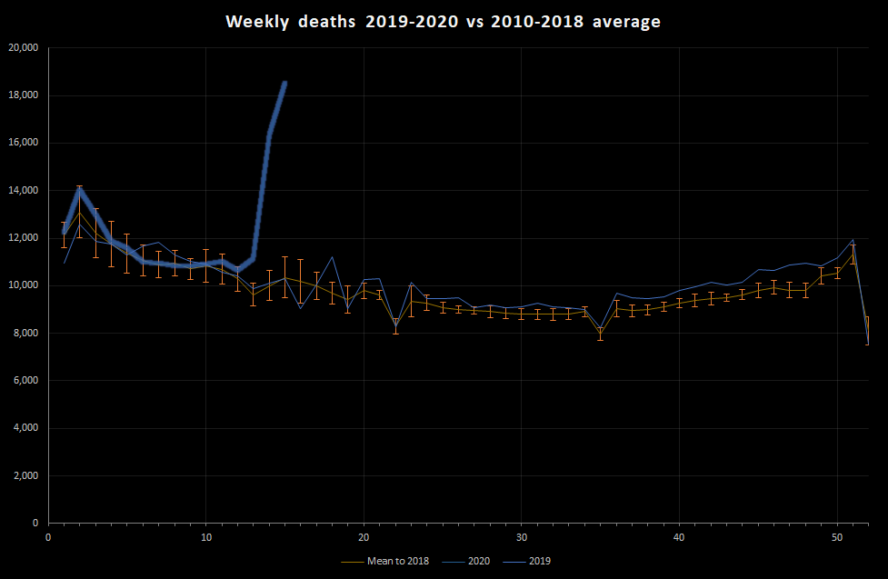
That’s quite a messy graph, so let’s do some stats. First, I calculate mean deaths per week for each of the 52 weeks between 2010 and 2018. This gives us a reference level. I can also look at how much that varies over years giving a sort of ‘normal’ year. Then I can plot the 2019 and 2020 data against that:
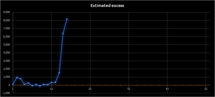
I can also subtract the average number of deaths to give an idea of how many more deaths than normal there have been each week this year:
Yes, there’s the rather alarming recent peak, but there’s other important information in these graphs, particularly if we combine them with some basic information about populations:
There’s more variation within a year than between years: Even in a normal year the weekly deaths are expected to vary between about 8,000 and 13,000 deaths per week in England and Wales.
Covid-19 is definitely more serious than normal flu: As of 10th April, we were experiencing over 18,500 deaths per week. This is about 8,000 more than normal for this time of year and about 5,500 more than a normal flu season peak. Overall, we had seen about 19,000 more deaths in 2020 than expected.
Most people won’t notice the deaths immediately: This is one of the perverse observations about outbreaks. Most people do not really experience the deaths until the outbreak is well under way. The population of England and Wales is about 59 million. That means that, with 19,000 more deaths than expected, 0.03% of the population has died. That means, as at 10th April, we had had 1 extra death per 3,000 people (approximately – there’s a lot of rounding in that). That is a lot, but it is at a level where a lot of people will know of someone who has died, but most people will not have been in regular contact with someone who has died. At the moment, it’s as if we were experiencing 2 weeks’ worth of deaths each week.
The impact is much greater for some people than others: We all know that some groups are more vulnerable than others, and obviously those who have family and friends who are very vulnerable will be feeling that vulnerability. If we look at the graph and the difference between a normal flu season and the current death rate, we really see the societal impact. Our world is built to cope with a bad flu season because that is the most predictable cause of excess death. We are now in a situation where that capacity is being exceeded. This means that those people dealing with health care, burials etc will be experiencing much larger demand than they are designed to handle. The logistics of death are cruel.
What can we do?
Let’s be honest, people globally are doing their best. There are going to be mistakes and, because of the way outbreaks and world economics operate, those mistakes are going to have horrific consequences that are not going to be evenly distributed in society. However, pretty much everything being done falls into 5 buckets:
- Build capacity – This is necessary to manage the fact that there are more seriously ill people than normal. This may consist of hospital building, staff re-rolling and some huge changes to the logistics of healthcare provision. There is also a need to manage demand on services.
- Reduce transmission – This can be done through physical distancing, biosecurity measures around hospitals and care-homes, but also improved hygiene. Testing fits into this by allowing diagnosis so that the interventions to reduce transmission can be adjusted and targeted. Vaccination has an obvious role in this.
- Secure the vulnerable – Transmission will occur and the vulnerable can only really be protected through isolation from infection risk. This is a core principle of biosecurity and is helped by managing staff movements, reducing visits, closing footpaths across farms with high-risk people in etc. Testing fits into this by appropriate testing of staff in high-risk environments to reduce (but not remove) the risk to those being cared for.
- Work towards treatment – This reduces deaths but does not, alone, reduce burden and so it needs to be done alongside other work.
- Adapt – The logistics required to manage coronavirus are different to those required to manage other health or national emergencies. All countries are adapting in various ways. A key challenge will be the adaptation to other risks once the Covid-19 risk has been managed.
Different countries are balancing these in different ways. Be wary of over-excitable reporting, though. There have been a number of claims about some countries doing better than others. Reliable statistics are not always available and, where they are, they can show a more nuanced picture.
For example, there were initial reports that Sweden was doing fine without lockdown and there are now some concerns that it is failing. The mortality statistics for Sweden indicate that for every 1,000 expected deaths in the week to 3rd April, Sweden saw 1,213 deaths while England and Wales saw 1,158 deaths. These are within the margin of error of each other (i.e. we can’t distinguish between them). Sweden has a total population slightly above that of London, and the population is distributed around healthcare infrastructure in a different way to England and Wales. It is not really surprising that their approaches differ. Without a very detailed analysis, it is incredibly difficult to even guess what approach either country should have taken. Sweden may have judged that it could handle a relatively larger peak to their mortality curve, or they may just be using different disease modelling assumptions.
The key message, then, is that this is bad from a health systems perspective and will be a terrible time for many people. However, you may find yourselves and the people you know and love relatively unaffected or more affected by financial and other concerns than by coronavirus.
I hope that’s of some interest. If you’re fed up with coronavirus information and this is just too much, maybe just read some totally unrelated cartoons. That’s what I’d do.
0 Comments on “How science and statistics can keep us balanced”