Covid-19: Let’s continue to be balanced
Back in April, I wrote a post about coronavirus because I was getting annoyed by the poor quality of statistical reporting and was trying to make sense of the situation myself. Today, I want to revisit the data I used and see what new insights there might be.
If you were either of the people that read that (hi, mum!) you’ll remember that I came to five conclusions:
- Covid-19 is definitely more serious than a normal flu season
- Without intervention it would definitely overwhelm UK public services
- However, most of us will not be directly affected by deaths at the moment
- Those in health and social care and those handling the logistics around those are already severely affected
- It is rational that different countries take different approaches to managing an outbreak
To come to those conclusions, I looked at all-cause mortality. That is, data on all deaths regardless of cause. I did this because death certification is a bit variable between countries.
What’s happened in the UK
As before, I don’t know because Scotland and Northern Ireland have gone their own way with statistical monitoring. England and Wales report through the Office for National Statistics (ONS).
The most recent ONS death statistics go to the week ended the 8th May. These are preliminary statistics because some death reports can come in quite late, but the ONS reports them weekly from a couple of weeks previously. They’re usually pretty spot on.
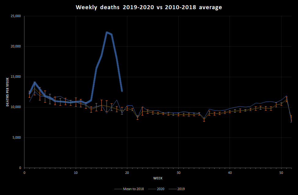
Here’s what they look like. The thick blue line is 2020, the light blue line is 2019, and the orange line is the average for 2010-2018:

This shows that, if we manage to stick with a single death peak, the peak deaths occurred in the week ended 17th April (week 16). The peak was really very large, but has come down very quickly. Remember, this is slightly old data, so if nothing has changed we are probably now either at or near normal death levels for the time of year.
That is pretty extraordinary.
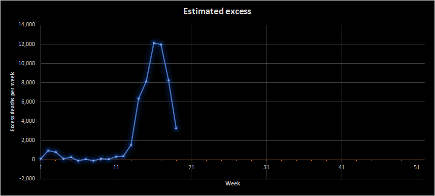
Let’s look specifically at excess deaths. The graph below shows the number of deaths seen minus the number expected for that time of year. This gives a reasonable estimate of the number of deaths attributable to the current situation. Note that this would include both coronavirus deaths but also other factors, such as deaths due to people not seeking treatment for other conditions and maybe a reduction in deaths due to road traffic collisions.

This shows that by the week ending 8th May (week 19) we were down to about 3,000 excess deaths a week. That’s still a lot, but it’s a lot more manageable. It’s roughly 21 deaths per 100,000 people when we’d expect 16. Remember, though, that this is an average; some places will be more affected than others.
So, we’re okay, right?
I think the numbers suggest that we are currently, in terms of health, doing pretty well. However, quite a lot of people are still dying, society is rather strange, and the government have adjusted the current restrictions in order to try getting things back to the ‘new normal’. I guess a lot of people are simultaneously pretty fed up with restrictions on their lives, excited about the chance of going somewhere away from their house, and pretty nervous about things opening back up too quickly and people getting sick. For some people, the lockdown process will have been profoundly distressing. For others, it will have been relatively benign.
Economically, and on other measures (such as population wellbeing), things are a lot more complex. The truth is that nobody knows what will happen next.
You will probably have heard of something called R0. This is the basic reproduction number, which is the reasoning behind the social restrictions. It isn’t the only thing involved in determining the number of cases and deaths, but it is important. It’s really capturing the extent to which our behaviour and environment contributes to the spread of virus. Generally in infectious disease, more dispersed populations have a lower overall R0, as do populations that interact less or have better hygiene. The R0 is an average measure; there may be a lot more spread in some areas or groups but, as long as these are contained the overall R0 may be managed well. It’s just a useful indicator and modeling parameter.
Other factors that affect the number of cases and deaths include things like the number of people in the population who are available to be infected, which depends on to what extent being exposed to the virus already will protect you from further infection. This affects the effective reproduction number. Currently, we don’t really know how much protection previous exposure to the virus gives you. When we’re looking at deaths, the rate of death will also be affected by the clinical protocols used for treatment. It’s very likely that the proportion of sick people dying will have gone down over time.
The goal now is to minimise the harm caused by health protection measures while avoiding the death rate and clinical burden creeping up. That’s why some easing of lockdown is occurring, but it’s also why vaccines are being investigated and why we are being encouraged to be circumspect when we do go out.
In England and Wales, the data are encouraging but it’s still early days.
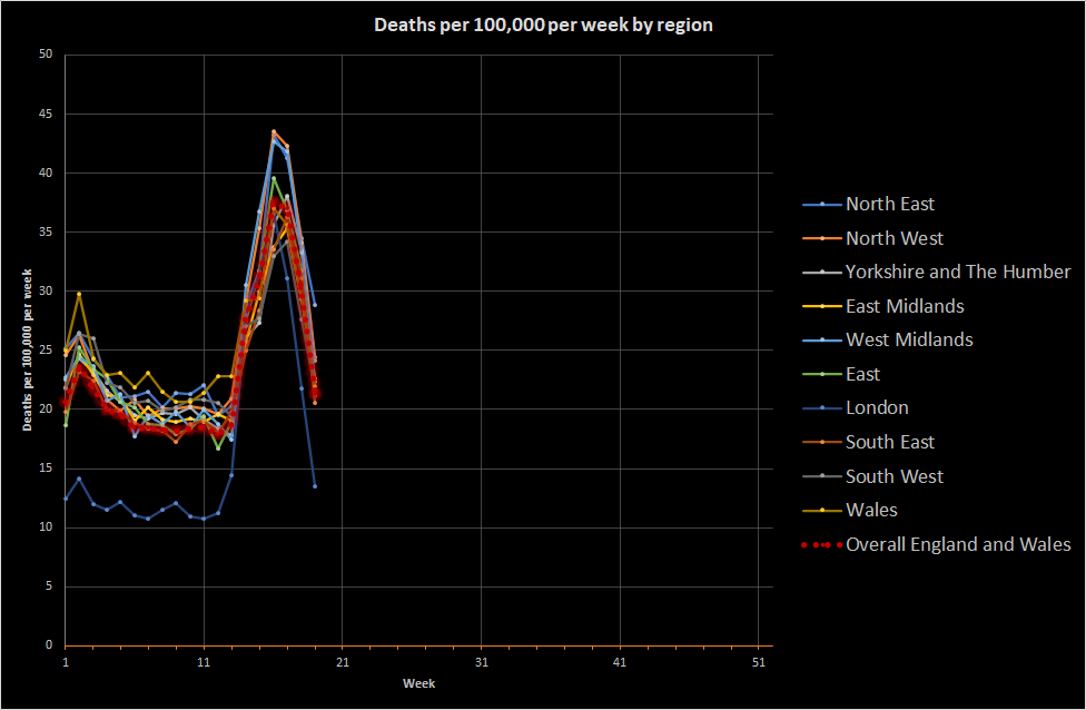
One final point on England and Wales. A lot has been mentioned about regional variation and some areas being x weeks behind others. The data do support marked regional variation in background death rates (which may be due to differences in the average age of populations or wealth etc). These swamp the differences in coronavirus deaths. The graph below shows deaths per 100,000 people per week across regions and the main observation is that we all got it within a week or so of each other.

If I were responsible for public health in England and Wales overall, my urgent focus would be understanding whether the peaks seen for the West Midlands, the North West, and the North East were really as high as they appear. My guess is that the major urban areas experienced a higher death rate attributable to coronavirus and that London is always shifted down relative to the UK because of demographic differences. The main thing, though, is that England and Wales get sick together. This shows how fundamentally interconnected England and Wales are and goes some way to understanding why a lockdown approach was chosen; disease moves quickly when you travel a lot. For future pandemics (which will occur), I would want to think about how to reduce that transmission without having to close the entire economy. I have some thoughts, but they’re not evidence-based so I won’t share them here.
What about other countries?
As I mentioned in the last post, I can’t find all-cause mortality data for Germany or South Korea, which are usually mentioned as having been particularly successful at controlling the virus. I don’t know either way. Sweden, though, does produce really good data. In fact, it’s too good. Swedish data is released for each day and is released before all the deaths have been added up. This means that:
- The deaths always look like they’re going down (because not all the deaths have been reported)
- The death rate fluctuates naturally quite a bit (because random variation is quite large in a small population)
As a result of this, I’ve chopped off the most recent Swedish data because it simply isn’t reliable (I’ve been tracking it for over a month to check this). Instead, I’ve used data up to the most recent England and Wales data because they appear to have a similar reporting lag.
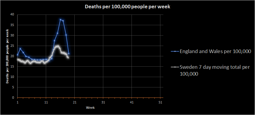
We can see something quite interesting. Here goes:

Sweden didn’t have the normal flu peak in January that England and Wales did and appears to have a slightly lower death rate. I don’t know why, but there are a lot of potential reasons, including demographic differences. What is quite noticeable is that Sweden did not have the same coronavirus-related peak that England and Wales had.
This is important because it is likely that the peaks were driven by illness that started prior to lockdown. The England and Wales peak dropped very rapidly as we’ve already seen, which is consistent with lockdown having an effect. In contrast, the Swedish peak is fading more gradually. Sweden did not lockdown in the same way as part of a deliberate policy.
If we assume that the peaks reflect infections prior to lockdown measures, there must be some other reason behind the difference in peak size. There are really only two general reasons: Either a lower proportion of the Swedish population had coronavirus at the time of lockdown or fewer Swedish people with coronavirus died. Now, it’s possible that Swedish healthcare is more than twice as successful as UK healthcare, but I doubt it (at least regarding critical care). Instead, it seems likely that Sweden had a lower disease burden to begin with and their containment measures were successful enough to bring the disease under control.
And?
Oh, I don’t know. Lockdown works pretty magnificently. Different types of lockdown in different countries probably have a different effect on disease spread, but what really matters is:
- How many people were sick to begin with
- How quickly you get control of the peak
It seems likely that the UK had a burst of infection just before lockdown. The rate of increase to the peak was dramatic,so it’s not likely that there was some massive reservoir of infection early on (although there may have been pockets). That means the transmission rate must have been large. Larger than in Sweden, which is more sparsely populated. The England and Wales regional data do seem to suggest an association with urbanisation, but I’d need more evidence to state that confidently. More fundamentally, there is an ongoing need to manage exposure in England and Wales because our natural tendency to spread coronavirus looks pretty high.
Really, though, as I said before: Different countries make different decisions based on their own circumstances. Those decisions are enabled by robust institutions and national and international data collection and analysis going on quietly and routinely every day.

0 Comments on “Covid-19: Let’s continue to be balanced”