Gnuplot: Some basics
The world is replete with amazing programmes that make life for numpties like me much easier. Graphing tools are something I particularly like. As someone who has to work on a range of different operating systems, cross-platform graphing tools are in their own little world of awesome.
This is a quick post about one of those: gnuplot.
I actually don’t use gnuplot that much. Most of the time, I either have to work in Excel because of clients*, or I do plotting within statistical analysis programmes like Stata or R. However, sometimes it’s just nice to use something that works elegantly and that easily handles data piped to it from other code.
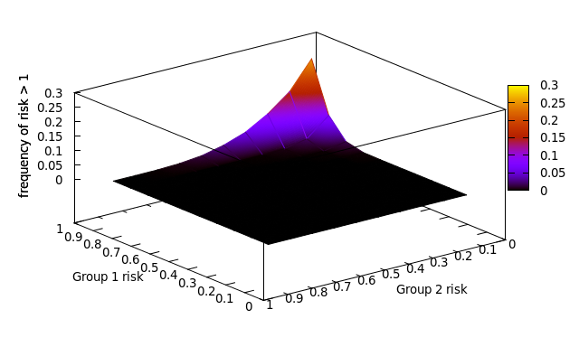
The example we’ll be using here is a neatly coloured surface plot that I produced for a paper recently. Surface plots are shiny and lush, but can be a right pain to actually produce.
That’s enough introductory guff. Let’s make something pretty. This example is in Linux, but Windows should follow the same principles. Here’s what we’re trying to produce:
Starting Gnuplot
Open a terminal and type:
gnuplot
That’s it.
Set a working directory
Use precisely the same code as you do usually in the terminal:
cd '/home/Monkey/Documents/gnuplotting
Yup, that’s still it. It’s sooo nice to have something that just uses normal code. If you’re using a data file, just make sure it’s in the working folder.
Set up your plot
This obviously depends a lot on what you’re trying to do. The main point is that it’s pretty intuitive. First off, my surface plot is 3d, so it has three axes (x, y, and z). I want to label them. To set the x-axis lable, I just set the xlabel characteristic:
set xlabel "Group 1 risk"
I can do the same with the y- and z-axis. With the z-axis, I’m also rotating the text:
set ylabel "Group 2 risk"
set zlabel "Frequency of risk >1" rotate
Then, I offset the y-tick labels using a simple vector. In practice, you can only really do this after an initial plot. Just play with it.
set ytics offset 1,0,0
Then, I tell the programme to treat my data as grid information. Basically, this is just warning the computer that I have a 3d scatterplot. I could specify how many x- and y-values I have, but there’s no need with this data set.
set dgrid3d
So far, I have enough information to draw a 3d scatterplot, but I wouldn’t get a nicely coloured surface plot. To create that, I need to apply some colour. The pm3d style allows this. It automatically uses the z-axis for the colouring. The interpolate option allows the colour to change at a finer scale than the data I put in:
set pm3d interpolate 0,0
Plot it
Just plot it. In this case, I am using the splot function. The u 2:3:1 bit just tells it which columns in my data file are. With pm3d tells it to use the pm3d options:
splot 'methodaerrors.txt' u 2:3:1 with pm3d notitle
Once you’ve plotted it, you can rotate the image and play with it before outputting it as an image.
Save it
There are lots of ways of doing this. You can often just copy the image to a clipboard and paste it into a document. If you want to save it as a postscript file (a handy vector format for posters etc.), the following code works nicely:
set term postscript eps colour
set output 'methodaplot.eps'
replot
That’s all there is to the example. The data file is:
If you want to delve into this a bit more, this page from Henri Gavin gives a really neat, short intro to lots of topics. This site gives detailed examples of plots and is a great place to get ideas for new and interesting ways of plotting your data.
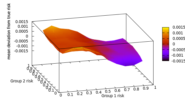
Just for fun, here’s another plot from the same paper:
* Do yourself a favour. Avoid using Excel for any serious analysis. Spreadsheets are great, but they are not suitable for proper modelling or statistical analysis. It’s a personal opinion, but I think the obsessive use of Excel has actually prevented health economic models from being transparent.
Leave a Reply
You must be logged in to post a comment.