Plotting data in R: An introduction
R is a commonly used piece of statistical software. It’s free, it’s flexible, and it has a huge user community. When you first experience success in using it, you will be amazed by what can be done with a piece of software that is freely available, particularly compared to the commercial alternatives, which are mostly hugely expensive.
R is certainly not the only software I use for plotting data (I’ll stick something up about gnuplot when I get a chance), but it is great for complex or unusual plots, particularly when there is some data manipulation involved.
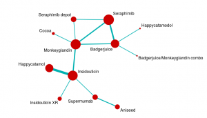
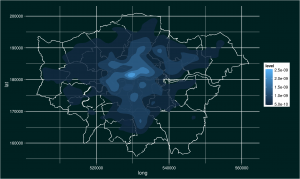
Here are a couple of examples of images produced in R.
The first is a network diagram of an evidence network for a network meta-analysis. The second is a plot of crimes in London. I’ll be showing you how to produce this crime plot as we go through these notes.
As usual with powerful software, R has some quirks that are pretty frustrating for new users. I use it alongside other programmes with different coding rules, and that means I frequently forget these quirks and end up relearning them with much swearing and gnashing of teeth.
The purpose of this post is to keep a record of some of those quirks to be a reference for me, and (hopefully) to help anyone starting out with R to see how great it is without pulling all their hair out.
I could start with a load of theoretical stuff about object-oriented programming and the relative merits of coding for your convenience or for computing efficiency, but there is no point. Let’s just write some code.
Structuring R code
There are probably lots of better ways of doing this, but most of the R coding I do follows a similar pattern. Specifically:
- Set the working directory
- Install any packages you want to use
- Open the libraries you want to use
- Import any data you are using
- Manipulate the data into the format you require for analysis
- Run the analysis
- Export the results
- Dial it up to 11
I’ll run through each of these in turn, using the plot of crime data to illustrate the code itself.
Set the working directory
The first thing I do is set the working directory. This is where files will be saved etc., and setting it early avoids you losing your work into your over-complex and messy filing system (oh yes, it is). To do this type something like:
setwd("/home/Monkey/Playing with R")
Note that you need to use a forward slash “/”. Some file managers use backslash, and getting this wrong can cause hours of frustration as you try to work out why your code isn’t working!
You can check what working directory you are using at any time by typing:
getwd()
For more information on working directory commands, look here.
Install any packages you want to use
One of the best things about R is that there are lots of people writing packages, which are collections of code that provide functions. These functions massively simplify your work, but also make it possible to use R with other programmes like WinBUGS.
To learn more about packages, look here.
In this case, I am installing ggplot2, maptools, and gpclib (which is, currently, needed for shapefile viewing). If you have already installed a package during a session, you should not need to install it again. However, I always include this bit in my code so that other people can use it. There is another command (‘require’) that can be useful, but let’s keep it simple for now.
As a quick note, you will often find that you need additional packages as your code progresses. Keeping them all together at the beginning of your code just helps you keep track of what’s going on while you add and remove code.
install.packages("ggplot2")
install.packages("maptools")
install.packages("gpclib")
When you type this, you will be asked to choose a “mirror”. This is just choosing the location from which you will download packages. They are all over the world, so choose one near you!
Open the libraries you want to use
Open the library for the packages you want to use. This is easy to forget, but you have to do it to be able to use the package. This may not make sense but, because packages are written independently of one another, they can have functions with overlapping names. If you only open libraries when you need them, you can avoid incompatibility issues between packages. The main reason I mention this is that you will sometimes want to open and close libraries at different points in your code. I have only really come across this while using packages for Social Network Analysis.
library("ggplot2")
library("maptools")
To allow us to use shapefiles in maptools, we need to type:
gpclibPermit()
This requirement may have changed by the time you use it, so check!
Import any data you are using
In this example, I am using two sets of data. First of all, I am using a shapefile for London. This is a file full of shapes (of course!) and this type of file is commonly used in the analysis of geographical information and in mapping.
The particular shapefile I am using is a file of London administrative boundaries from the London government datastore.
An important point when using shapefiles (which took me a while to realise) is that, even though you only directly use the .shp file, you need the .dbf and the .shx files in the same folder. This is because the .shp file calls on information from these other files.
To import the shapefile data, I make sure the shapefile is in the working directory, then type:
londonshape <- readShapePoly("London_Borough_Excluding_MHW.shp")
This creates an object called londonshape that contains the shape data from the shapefile. If you want to see the contents of this object at any time, just type:
londonshape
If you do this, you will notice that the x values vary between 503568.2 and 561957.5 and the y values vary between 155850.8 and 200933.9. These are the maps co-ordinates of the shapes in the file, and this tells us that the file is using eastings and northings. More on this in a moment…
Okay, so we have our shapefile data. This gives us the map of London. Now we need our crime data to plot on top of this. There are number of sources for this sort of data, but I went straight to the London government datastore. The main reason for this was to maximise the chance that my data were using the same co-ordinate system. It is possible to convert between them, but it’s a pain.
To use the data, I downloaded it into my working folder and imported it. The data is stored as a comma-separated text file so I read it as a comma-separated file using the read.csv command (specifying that there is a row of header data):
crimedata <- read.csv("police-uk-crime-data-mps-city.txt", header=T)
This reads the file and turns it into an object called crimedata.
The text file is huge because it contains a lot of data. R handles this pretty well, but it may still slow down, particularly if you’re running it on an ancient netbook (like I currently am). You will know the file has been read when the line prompt (>) reappears.
When you have large files like this, you really don’t want to check on the file by looking at its full contents. Instead, it is better to look at specific attributes and check it is behaving itself.
First we check what class of object we have created by typing:
class(crimedata)
You should have a data frame, which is like a big table. We can then look at each of the columns within the data frame. This allows us to both check what data headings we have without having to read the whole file and to check that the data is in an appropriate format. To do this, type:
sapply(crimedata, class)
Finally, we can check some of the data itself by typing:
head(crimedata)
This shows us the first few rows of data. We can get a lot of this information in one hit by typing:
str(crimedata)
This tells us about our data structure.
If you look carefully at the data, you will see two columns labelled Easting and Northing. The numbers in these columns are generally within the ranges of the x and y co-ordinates for the shapefile. This is good, because it means the two data sources are using the same co-ordinate system. That’s a relief.
So far so good. We have some shape data and some tabular data, both of which have geographical co-ordinates. However, our aim is to produce a plot. In order to do that, we have to have some plot objects. This brings us to the next coding stage.
Manipulate the data into the format you require for analysis
I’ve decided to use the package ggplot2 for plotting. Unless you’re doing some specialised type of plotting (e.g. social networks), this is probably the plotting package you will want to use. In order to plot something in ggplot2, you turn it into a ggplot object or create a ggplot object from it.
There’s lots of information around on how ggplot2 works, much of it as clear as mud. The essential observation is that ggplot objects are made up of layers consisting of data, the relationship between data and appearance (called ‘aesthetics’ in ggplot), geometric objects, and statistical actions. I would also add in a layer for the theme, although I have no idea if this is a theoretically correct way to do things. The point about layers is that you can add them up to build up a complex object. This means that you can add several data layers, a series of geometric objects etc.
If you think about your plot as a series of layers, the coding is a lot simpler. If you try to do everything in one lot, it usually (in my experience) goes wrong. Just keep it simple, get each bit right, and put it together logically.
The easiest way to show this is with some code. In the case of the plot of burglaries in London, I start by creating a plot object, I add a theme, then I add a data plot layer containing the London map before, finally, adding a plot layer with the crime density on. Let’s start by creating a ggplot object using the ggplot command:
londonmap <- ggplot()
This creates a plot object to which we add a theme. A theme is a series of instructions detailing how a plot will look and work. This code may look a bit complex, but it isn’t. First of all, you see that we are doing object-oriented programming because I am changing the object londonmap by performing an action on it. Secondly, you see that we can specify our theme using theme() and components (e.g. plot.background), elements within those components (e.g. the rectangle that defines the background ‘element_rect’) and finally specifying some feature of it (e.g. a fill colour in hex or text):
londonmap <- londonmap + theme(plot.background=element_rect(fill="#002121"), panel.background=element_rect(fill="#002121"), axis.text=element_text(colour="white"), axis.title=element_text(colour="white"))
At this point, we have a plot object and a theme for that object, but we still won’t see anything plotted because we haven’t added a data or a plot layer. First we add the London map layer:
londonmap <- londonmap + geom_point(data=londonshape, aes(x=long, y=lat), colour="white", size=0.5)
The geom_point is a geometric layer. This contains a data layer (londonshape) and an aesthetic layer (aes()). This gives us a map of London. To check everything is working, plot it by typing:
londonmap
Then we add the crime layer:
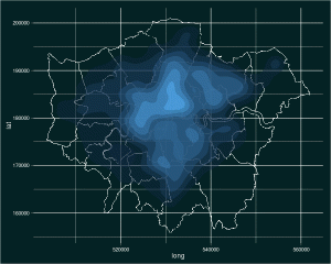
londoncrimemap <- londonmap + stat_density2d(data=subset(crimedata, Crime.type=="Burglary"), aes(x=Easting, y=Northing, fill=..level..), alpha=0.5, contour=TRUE, geom="polygon")
This is actually quite a complex layer, so let’s break down what is going on. First of all, I have created a new object, londoncrimemap. This is because I know this is a tricky bit of plotting, and I don’t want to have to start again if/when I screw it up. Secondly, the primary layer in this case is a data later defined by some statistics (stat_density2d). This is necessary because the raw data I am using are individual crime reports. To get the data in the form I want, I perform some analyses to calculate the density of crimes. As a result I have a data layer that contains a geometric later (geom=”polygon”), as well as aesthetics. I define the subset of data I am interested in (burglaries) using the subset command. Also, note the use of alpha to make this layer partially transparent.
This gives us the plot we were trying to produce.
Run the analysis
This stage in code production is really more important when we are doing proper statistical analyses rather than simple plots. For this plotting work, all we have to do is ask R to show us the object.
londoncrimemap
Export the results
ggplot2 is great for exporting the results of our plotting, because it has a built-in save function. To save a copy of the image we have produced in the working directory, we simply type:
ggsave(filename="Londonburglarymap.png")
Dial it up to 11
We’re basically done. However, there’s one stage I think is important and often overlooked. I’m calling this stage Dial it up to 11 because it means getting a bit ridiculous with your work. Here’s what it is:
You’ve probably just spent quite a long time trying to get your analysis or your plot to work in exactly the way you want. You may have had to look up new packages or functions, debugged dodgy code, and gone for several long walks to figure problems out. You now need to make sure you don’t waste that effort. To do this, you have to do two things:
- Save your code – use a text file, and make sure you have comments in it so you can re-use the code in the future. If you put a hash (#) before a comment, R will know to ignore it. This means you can save code and commentary and just paste the lot into R in the future to run the full analysis again. Very nice.
- Play around – once you know the general principle of what you’re trying to do, you can have a tinker. With the crime data above, you may decide to look at particular crimes of interest (violent crime shows a very focal pattern), or you may like to look at crime over time. That’s what I did.
The tinkering stage (in life generally) is under-valued. Playing allows you to develop new skills and embed ones you’ve just learned. This speeds up serious work at a later date and increases your reserves of awesome for just when they are needed.
In case you’re interested, my tinkering produced an animated image of the density of burglaries over time. Here it is (click on it to see it animate):
There you have it. Plotting in R is tricky, but rewarding and highly useful. To simplify it, I like to use an eight-stage approach:
- Set the working directory
- Install any packages you want to use
- Open the libraries you want to use
- Import any data you are using
- Manipulate the data into the format you require for analysis
- Run the analysis
- Export the results
- Dial it up to 11
I hope that’s useful. Please do let me know if there’s anything else that would simplify your plotting fun.


Leave a Reply
You must be logged in to post a comment.